SITH
^click image to play^
Creative Direction
-
-
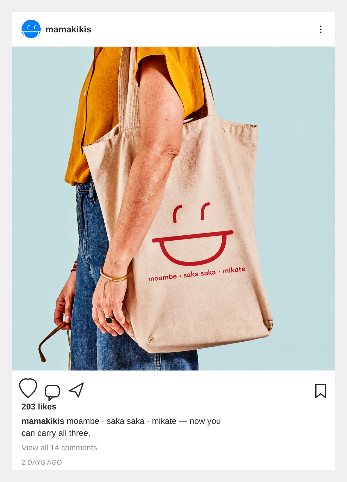
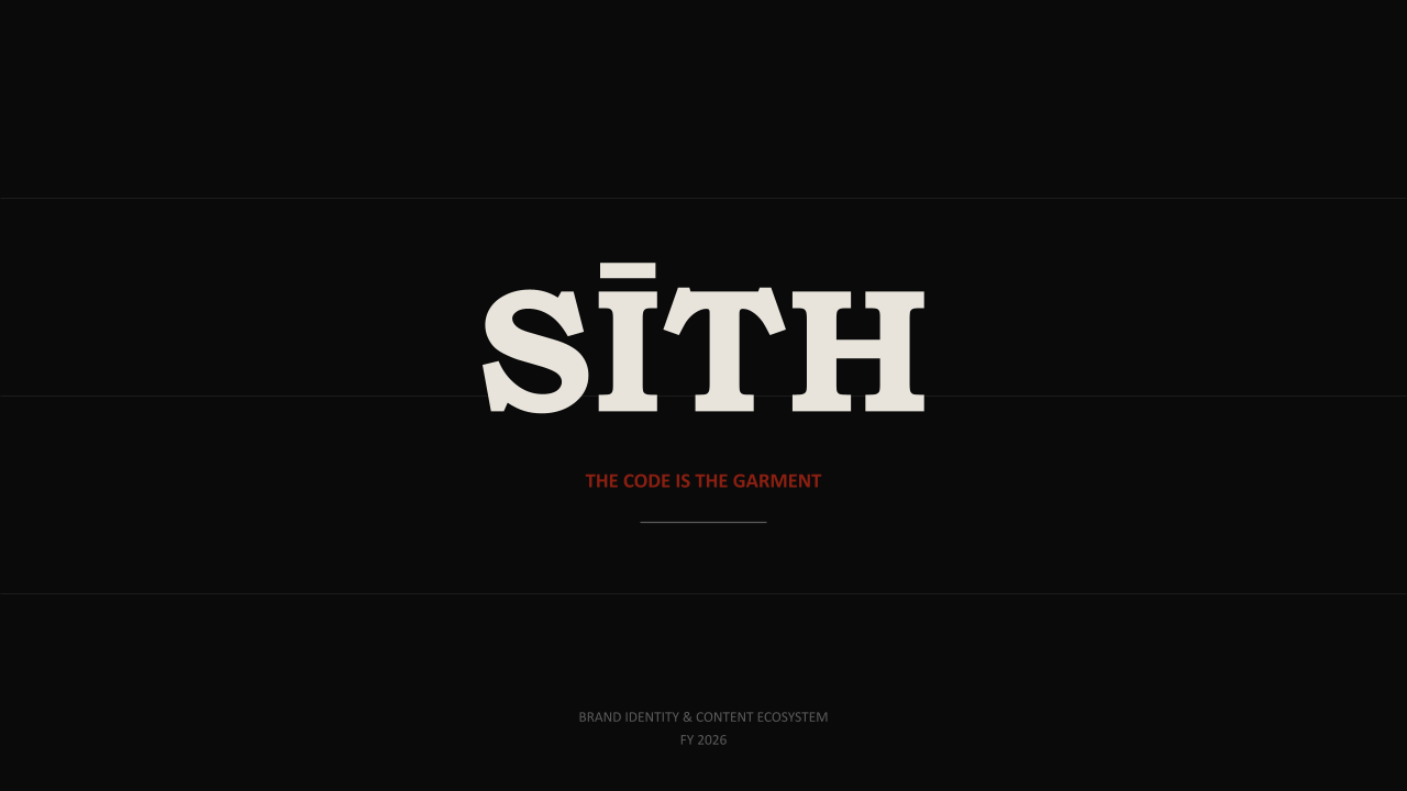
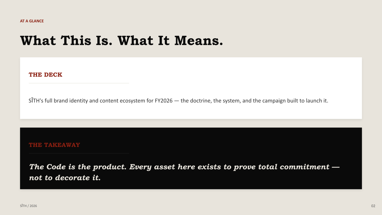
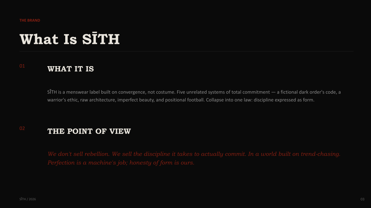
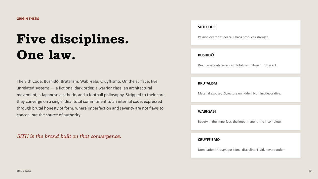
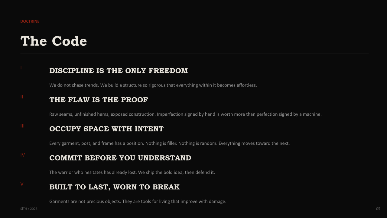
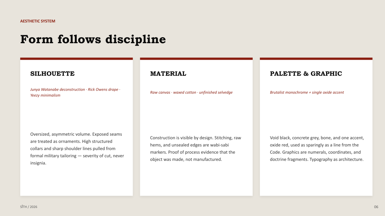
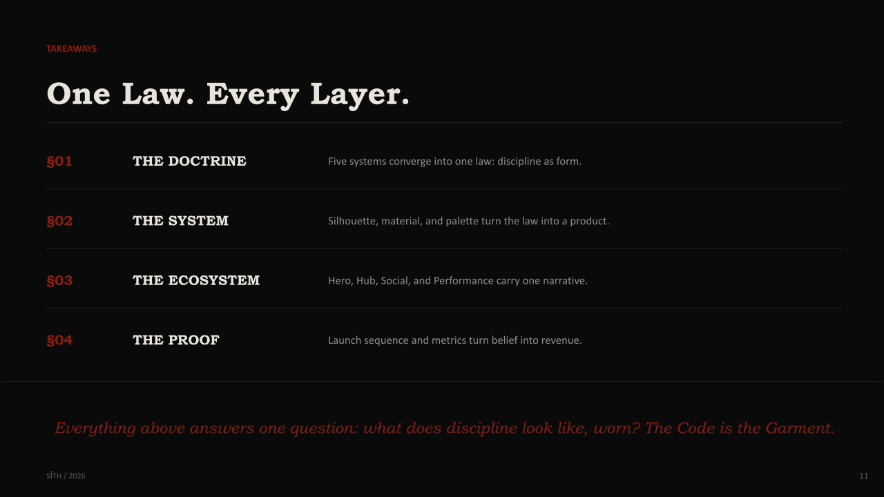
SĪTH is a menswear label for people who treat discipline as the ultimate aesthetic. Rooted in the conjunction of five systems of total commitment. A fictional dark order's code, a warrior's ethic, raw architecture, imperfect beauty, and disciplined football. SĪTH collapses them into one law: honesty of form over decoration. It's bold in its severity and unmistakably distinct from streetwear built on hype and manufactured scarcity, targeting athletes, makers, and minimalists tired of brands that perform rebellion instead of practicing it.
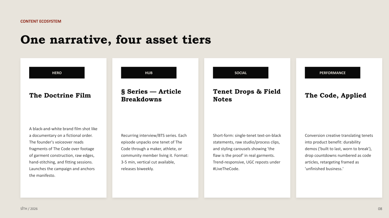
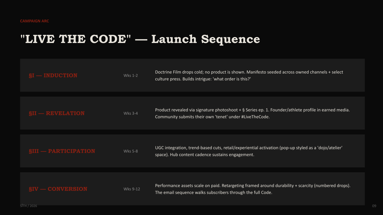
The "Live the Code" campaign is built as proof, not promotion. It opens with a film, no product, no logo, to spark intrigue before revealing the collection through a signature photoshoot and a recurring interview series that shares the brand's philosophy with real practitioners. Short-form content and performance creative then carry that same doctrine into feeds and retargeting, translating each tenet directly into product benefit.
Community sits at the center of the strategy: rather than inviting followers to perform, SĪTH asks them to submit their own tenet. Scarcity and participation, not spectacle, drive advocacy. Capsule product release alongside experiential activations styled like a dojo rather than a pop-up.
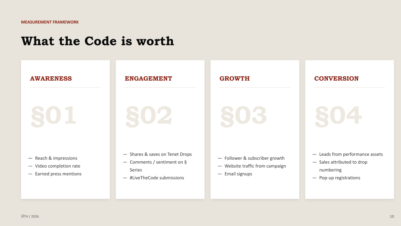
Success is tracked quietly, through earned press, sentiment, community submissions, owned-channel growth, and product resonance. Proving that discipline, applied consistently, converts belief into revenue.
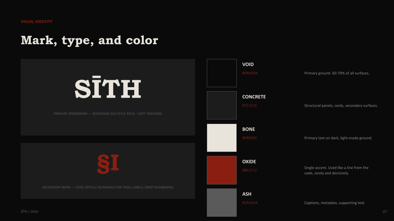
Below is the Brand Identity and Content Ecosystem behind SĪTH and how its philosophy takes shape as a visible system, and how that system moves across every channel to build the brand.
Role: Creative Direction - Brand Strategy - Editing.
MA Wellness

Creative Direction
-
-
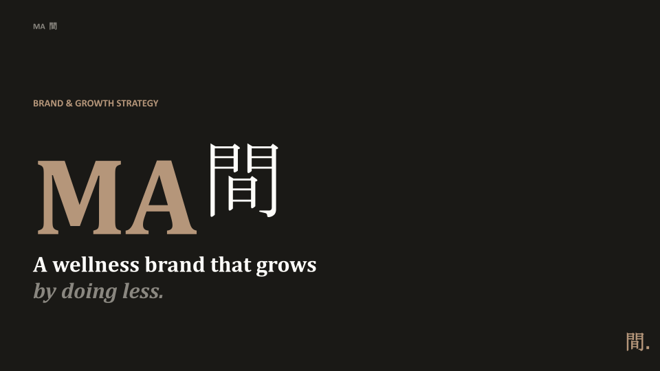
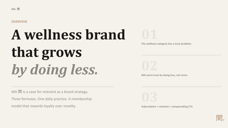
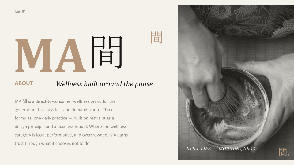
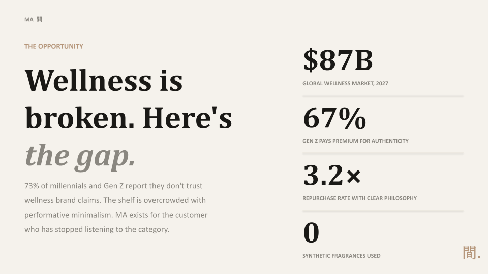
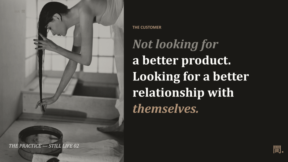
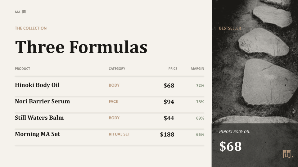
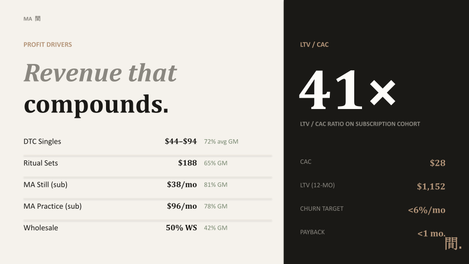
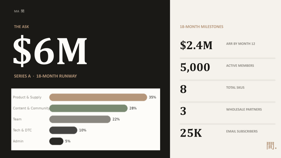
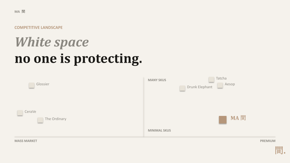
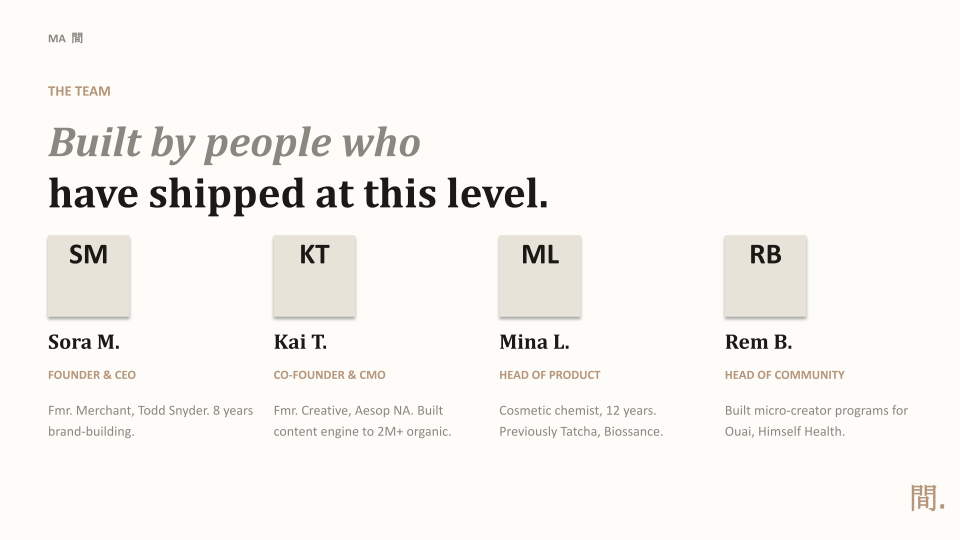
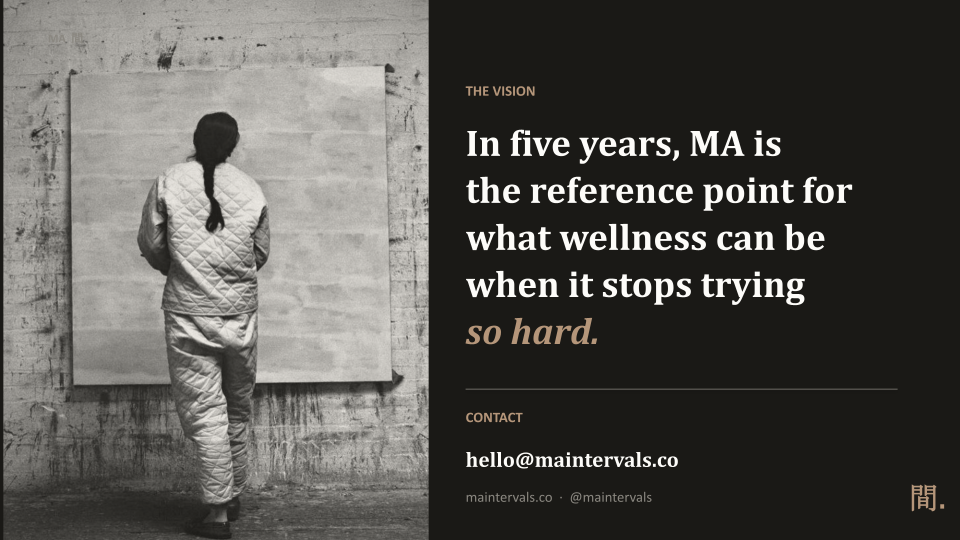
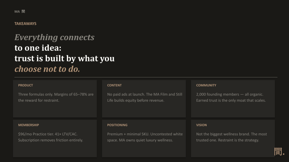
MA is a wellness brand for people exhausted by a category that shouts. Built on the Japanese principle of negative space, the meaningful pause between actions. MA incorporates three formulas, one daily ritual, and a membership model into a single law: trust is earned by what a brand chooses not to do. Restraint isn't a mood board line; it's the business model.
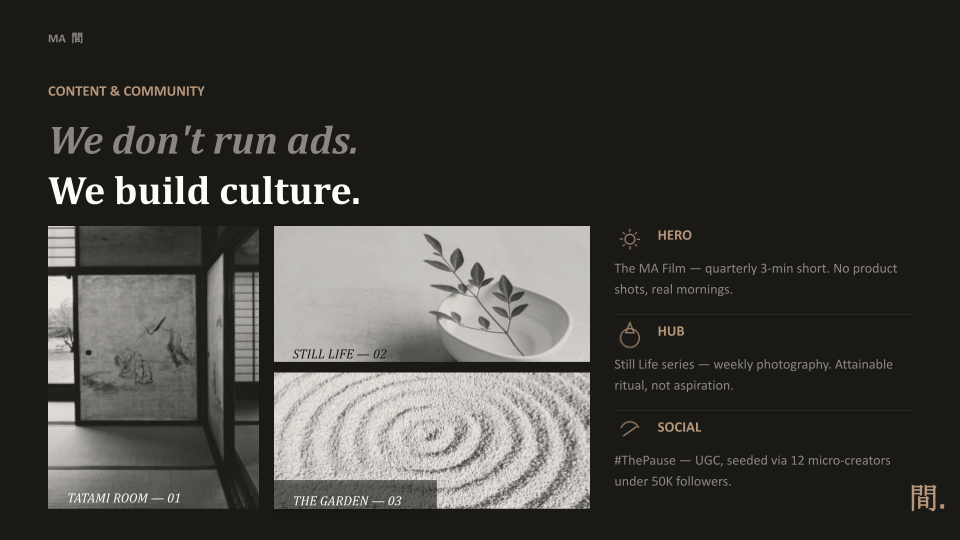
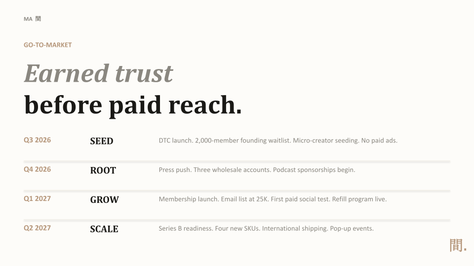
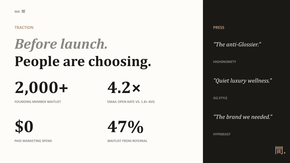
The Practice campaign proves it, rather than claims it. It opens with no paid media: a quarterly MA long-form content and a recurring Still Life series that builds brand equity before a single dollar of revenue is asked. By letting 2,000 founding members join organically ahead of the public launch. From there, content splits into a hub of ritual-focused photography and a social layer built around real member moments, each piece translating the same principles: do less and turn it into a reason to subscribe.
Community is the growth engine, not an audience. Membership, not marketing, is the mechanism: MA Practice subscribers convert at 41x LTV/CAC, and referral drives nearly half of new waitlist growth. Success is measured in the language of restraint, retention, organic reach, and margin, not impressions.
Role: Creative Direction - Brand Strategy
Mama Kiki’s
^click image to play^
Creative Direction
-
-
Mama Kiki's needed branding that could balance two key concepts: three generations of Congolese family recipes and a counter designed for a 90-second order. Most fast-casual brands typically focus on one approach. Heritage tends to take time, while speed can often seem generic. This brand had to effectively convey both ideas simultaneously.
Four wordmark directions were explored before landing on an answer: a condensed editorial lockup, a stacked mark with a dot accent, a script-and-block pairing, and a lowercase treatment with an underline. The stacked version won. It holds up at counter-signage scale, shrinks cleanly to an app icon, and its dot doubles as punctuation, a plate, or a clock hand — one small mark carrying the brand's whole tension without needing to be repeated.
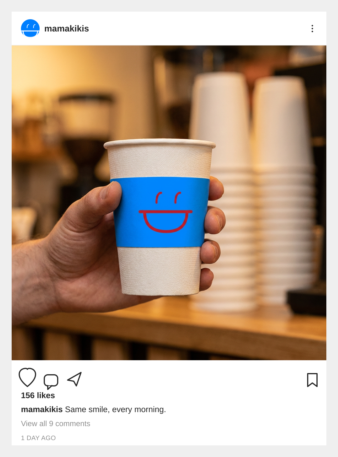
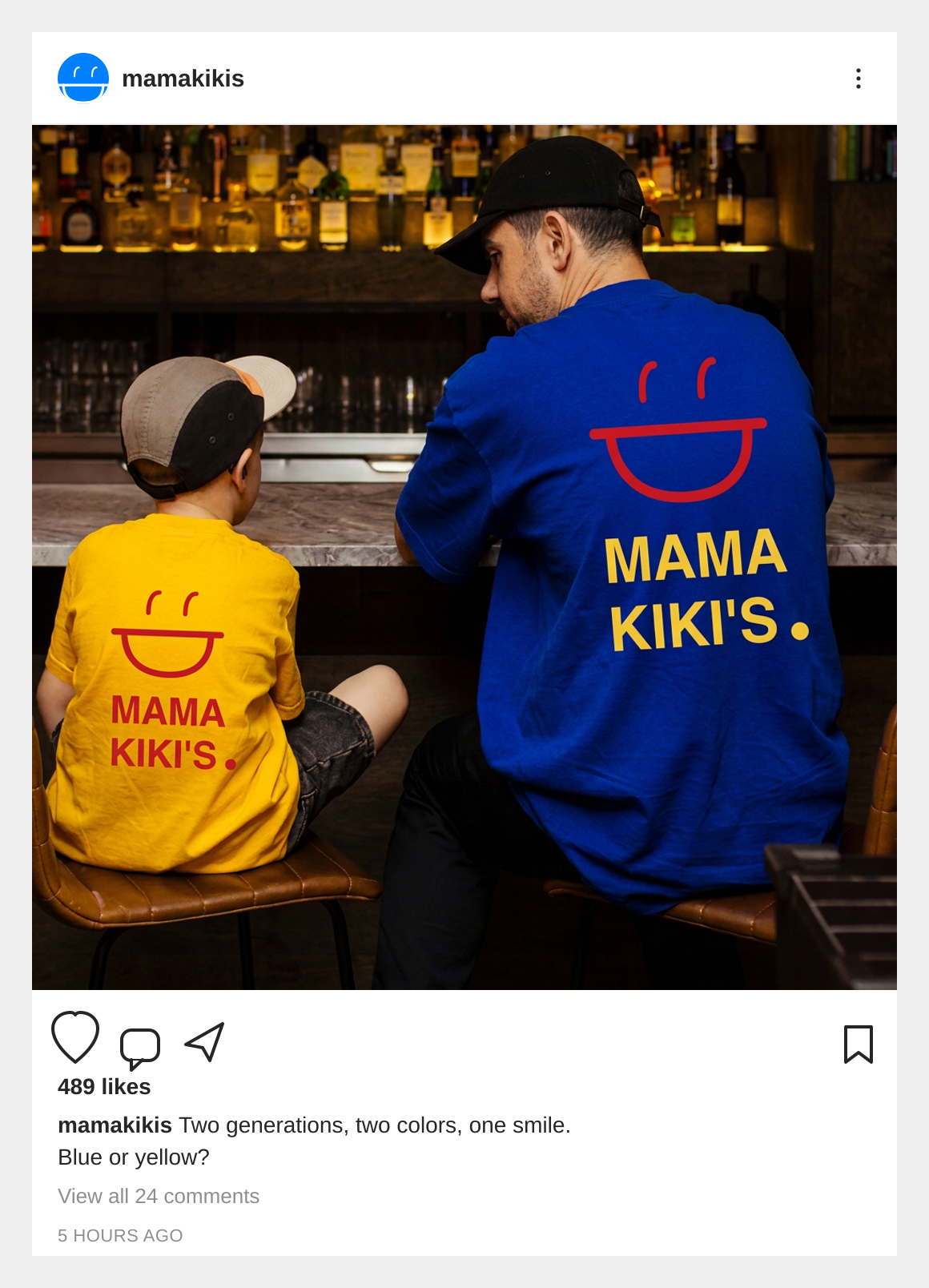
The real differentiator isn't the wordmark, it's the palette. Instead of picking colours that felt "food-brand appropriate," the system pulls directly from the flag of the Democratic Republic of Congo: azure blue as the primary ink, red as the sharp accent, yellow reserved for the moments that need it most. It's a small decision that turns an ordinary logo choice into something that couldn't belong to any other restaurant.
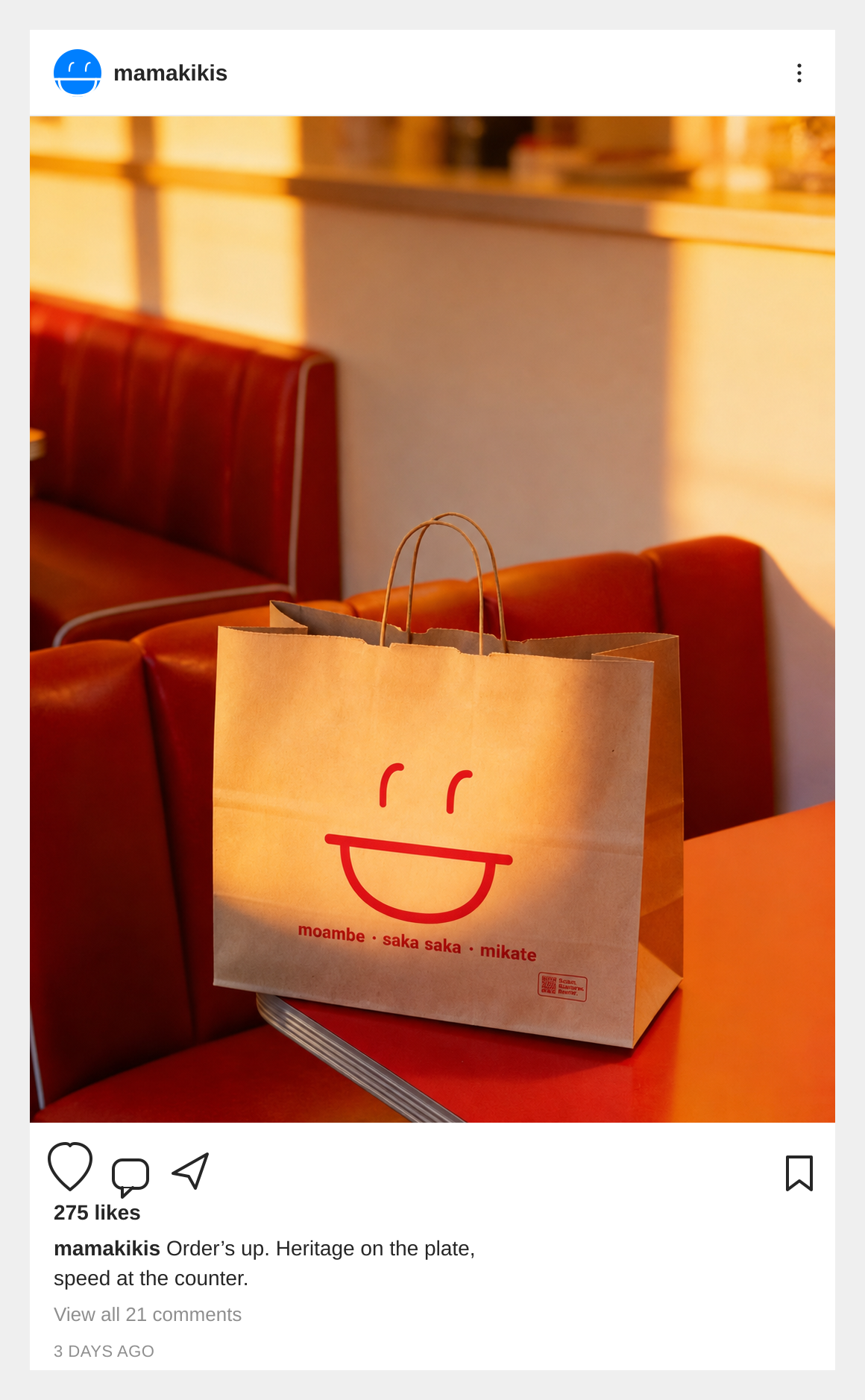
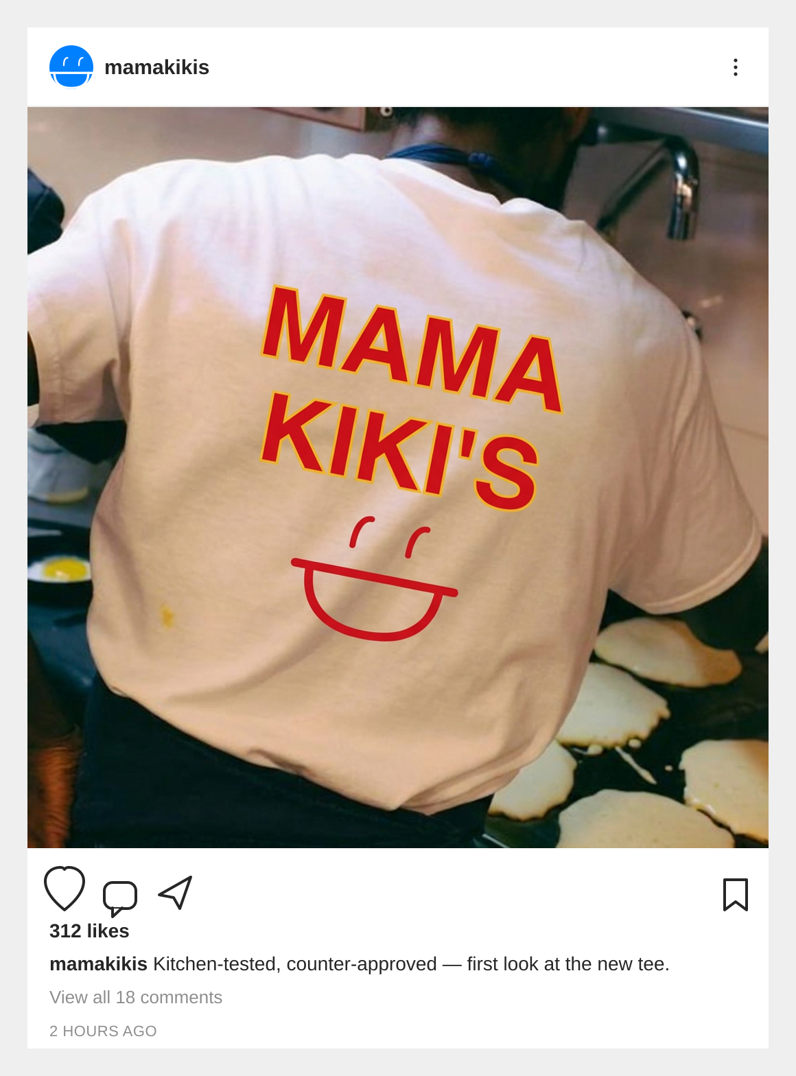
From there, the system had to demonstrate its ability to travel. A seal monogram and a bowl-and-clock icon cover the small placements a wordmark can't reach. Kraft packaging carries the mark without shouting it. Merch turns a customer into a walking sign. The goal throughout was a system that still reads as intentional at every size, from a favicon to a storefront.
Below are mockups that showcase the Brand Identity brought to life across a range of applications. These examples illustrate how the visual system translates into real-world touchpoints.
Role: Creative Direction - Brand Strategy